人生不过短短三万天,工作就要占掉一半。
作为可能要打工到80岁的资深闲鱼,没有什么可以阻止我们原地躺平。不过如果办公室比家还舒服,似乎996、007也就没那么面目可憎了。
毕竟一个张弛有度的工作环境,才能让打工人更愉快地摸鱼工作。所以老板们必须要明白这个道理,只有打工人心情好了,工作效率才会像火箭,嗖嗖嗖窜到太空!
Life is just 30,000 days, while work takes up half of it.
As a couch potato who may have to work until 80 years old, there is nothing to stop us from slacking off sometimes. But, if the office is more comfortable than home, it seems that working from 9am to 9pm 6 days a week is not so odious.
After all, a relaxed work environment is able to make the workers work more happily. The bosses must know that as long as the workers are in a good mood, they will have high efficiency more easily.
知名企业ASA(亚细亚)瓷砖在90年代进入到香港市场后,当初为了更好地进行管理,展厅与办公空间一直紧密关联。随着品牌升级需要,企业期望为消费者带来更好的产品体验的同时,也为公司员工营造更好工作环境。
2021年,OFT设计用设计帮助ASA瓷砖进行品牌升级。这次品牌升级主要分为两步:一是展厅升级,二是办公升级。
在展厅设计中,OFT设计构建了“生活方式展览”的消费新体验;
而在办公空间中,OFT设计则以“社交与共享”、“复合与集成”作为空间新的命题,让打工人工作和摸鱼两不误。
After the well-known company ASA Tile entered the Hong Kong market in the 1990s, the showroom and office space have been closely related to each other for better management at the beginning. With the need to upgrade the brand, the company expected to bring better product experience to consumers while also wanting to create a better working environment for the company's employees.
In 2021, Oft Interiors help ASA Tile carry out a brand upgrade. This brand upgrade is divided into two main steps: one is the showroom upgrade, and the other is the office upgrade.
In the showroom design, Oft Interiors has built a new experienceof "lifestyle exhibition" for consumption.
In the office space,Oft Interiors takes "socialization and sharing" and "compound and integration" as the new proposition of the space, so that workers can concentrate on work or loaf on the job.
随着未来办公概念出现,办公室从基础办公场所,变成更强调企业品牌文化、员工效率诉求、身份认同、组织架构维系和商务交流的社群,而社群的形成则需要更丰富多元的办公场景进行承载。
With the emergence of the future office concept, the office become a community putting more emphasis on corporate brand culture, staff efficiency requirements, identity, organizational structure maintenance and business communication instead of basic office space. And the formation of the community requires a richer and more diverse office scene to carry.
ASA办公室面积仅有164㎡,空间虽小,四大核心功能区域:公共办公区、私密办公区、会议区及休闲娱乐区,仍然必不可少。
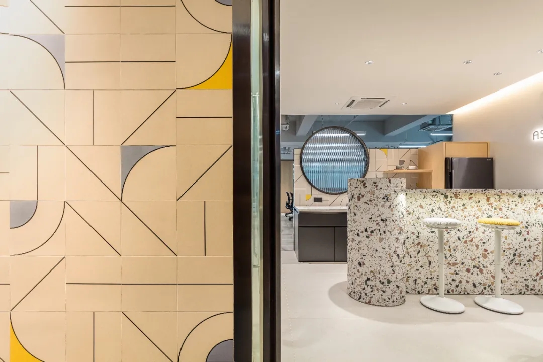
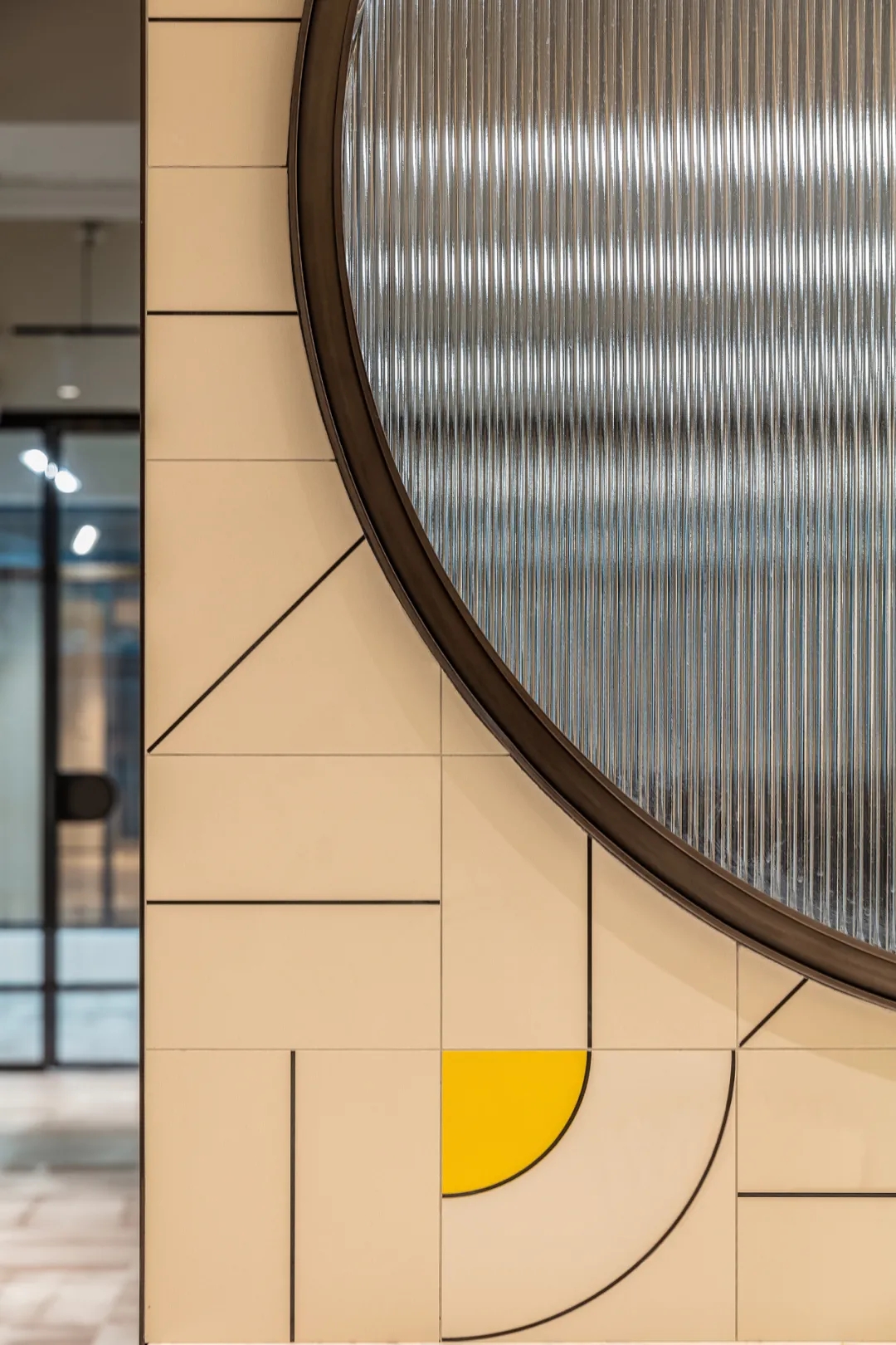
入口处,设计师以公司产品——花砖拼贴出涂鸦风格背景墙,通过材料充分地展现品牌特性。
The ASA office has an area of only 164 square meters. Although the space is small, the four core functional areas are still essential: public office, private office, meeting area and recreation area.
At the entrance, the designer used the company's product, flower tiles, to collage the brand logo in graffiti style, fully showing the brand's characteristics through the material.
进入前台便来到休闲社交区,之所以把公共活动区域设置在靠近前台位置,是设计师有意识地把共享区与办公进行分隔。
在这个区域中,设计师用一个物理空间创造出社区氛围,这个空间既形成了入口处的缓冲地带,又承担了共享/休闲/讨论/接待的复合功能,提升使用效率及空间价值。
Enter the front desk and you will come to the casual social area. The reason for setting the public activity area close to the front desk is that the designer has consciously separated the shared area from the office.
In this area, the designer used a physical space to create a community atmosphere. This space forms a buffer zone at the entrance, but also assumes the composite function of sharing, leisure, discussion and reception, enhancing the efficiency of use and the value of the space.
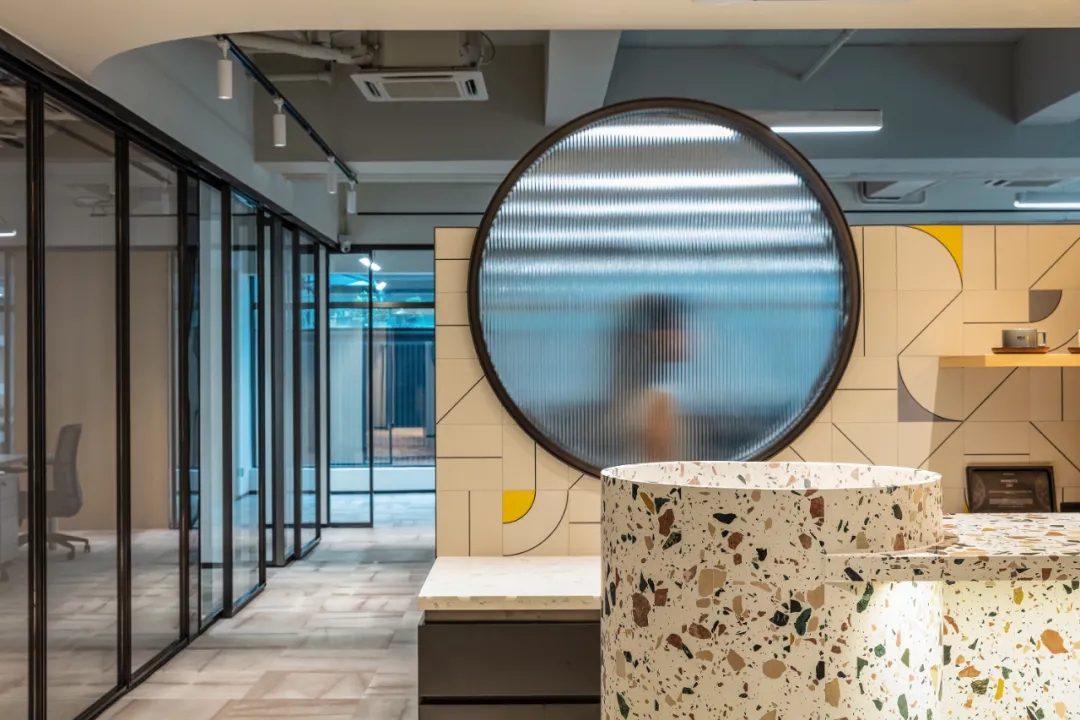
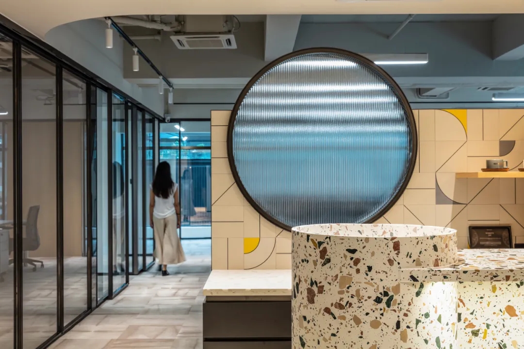
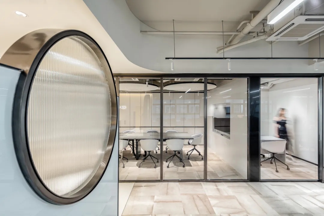
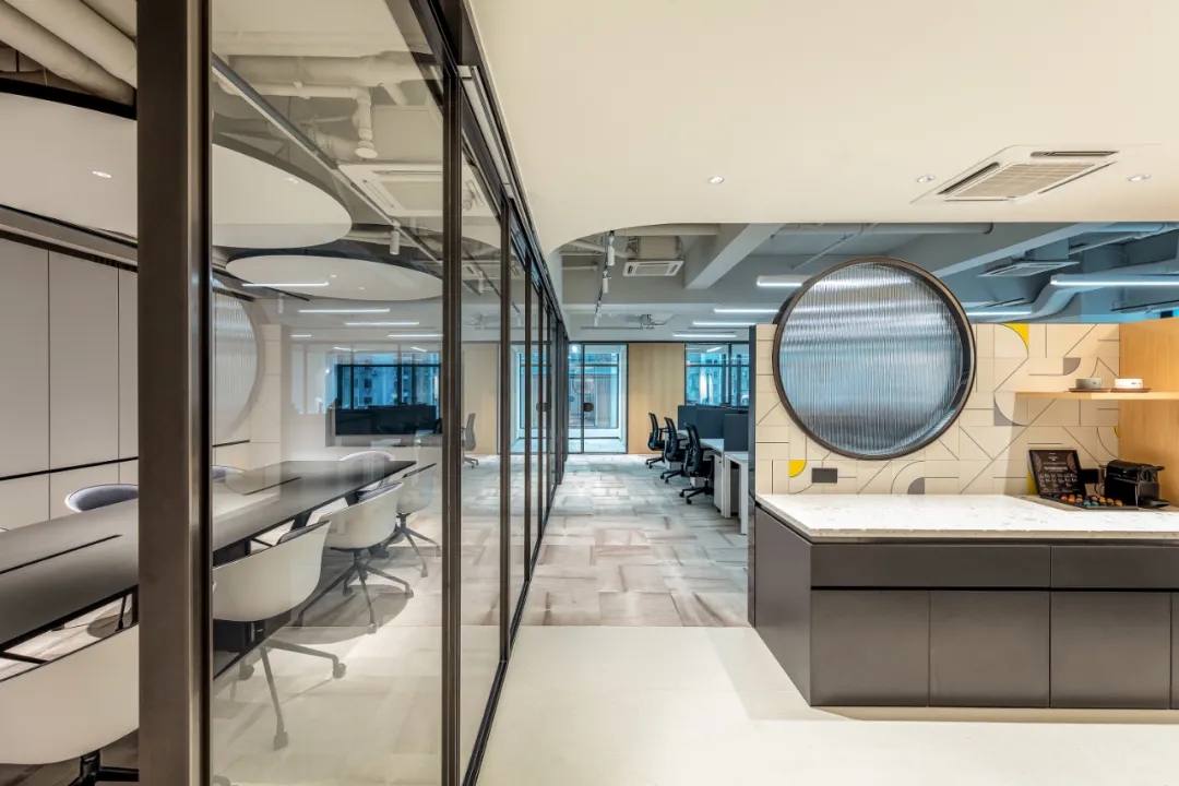
在休闲与办公区之间的隔断墙上,设计师以一个圆形长虹玻璃打破沉闷,为空间增加更多通透性与趣味性,在隐约间,让空间重新串联。
On the partition wall between the leisure and office areas, the designer breaks the dullness with a circular iridescent glass, adding more transparency and interest to the space, and in a vague way, allowing the space to be re-linked.
以此同时,整体拼色与休闲吧台区背景相呼应,再次点题品牌产品属性。
With this, the overall color blocking echoes the background of the leisure bar area, again pointing out the brand product attributes.
要说寸土寸金的香港,什么最贵?那一定是人力与空间,因此,办公空间更需要高效集成利用。
让办公空间价值翻倍同样是本次设计的核心之一。
现代办公空间主要分为四大核心区域:开放办公区、私密办公区、会议区、休闲社交区。在这个不算大的办公场景中,OFT设计把四大核心区域变成四大功能模块,这四大功能模块之间可以交互与延伸,组成新的模块。
What is the most expensive thing in Hong Kong,a place where every inch of land is precious? It must be manpower and space. Therefore, office space needs to be efficiently integrated and utilized.
To double the value of office space is also one of the core of this design.
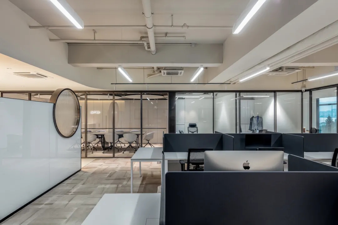
根据空间动线,在穿过第一视觉中心的社交空间后,便是开放式办公区。
OFT根据根据员工工作属性及内容,以统一的设计语言及集成办公家具,让开放式办公区也具有一定私密性,有利于提升工作效率。
According to the spatial movement line, after passing through the social space of the first visual center, there is the open office area.
According to the work attributes and content of the employees, Oft Interiors used a unified design language and integrated office furniture so that the open office area also has a certain degree of privacy, which is conducive to enhancing work efficiency.
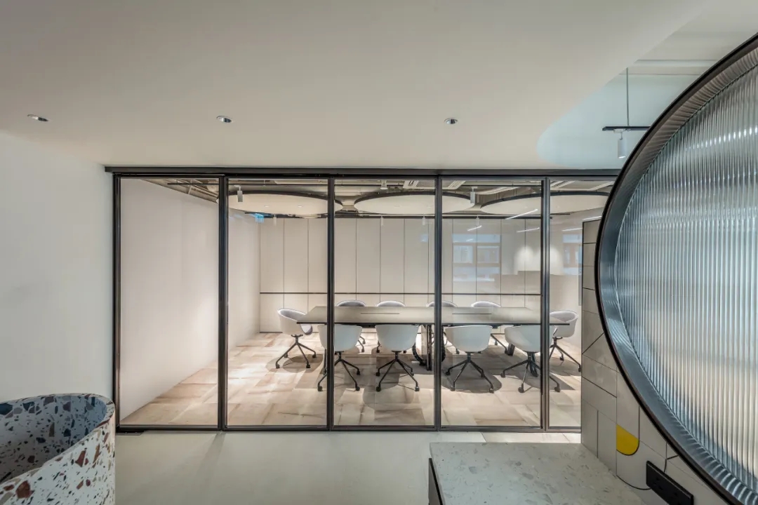
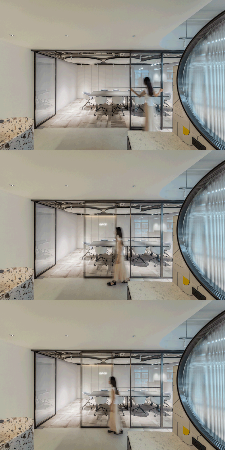
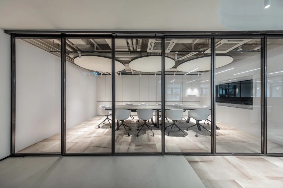
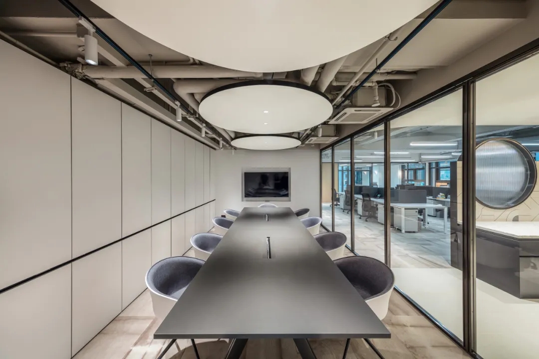
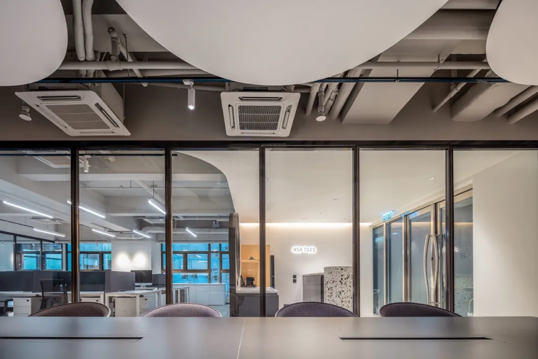
随后,来到空间的重头戏——会议区,会议区竖向布局在开放式办公区及社交区域的一侧,黑框窄边玻璃推拉门形成会议室隔断系统。
Then, the highlight of the space - the meeting area.It is vertically laid out on the side of the open office and social area, with black-framed narrow-edge glass sliding doors forming a meeting room partition system.
为了功能版块组合的多样性以及空间价值最大化,玻璃门可以进行全面折叠,在全部打开之后,分开的两个点(区域)就会连成一条线(实现功能面积最大化)。
In order to maximize the diversity of the combination of functional sections and the value of space, the glass doors can be fully folded so that when they are all opened, the two points (areas) that are separated will be connected into a line (to maximize the functional area).
这样,休闲与会议两个不同功能版块,便可以更灵活地在正式会议与派对时间中轻松切换。
In this way, the two different functional sections of leisure and meeting can be more flexible and easily switch between formal meetings and party time.
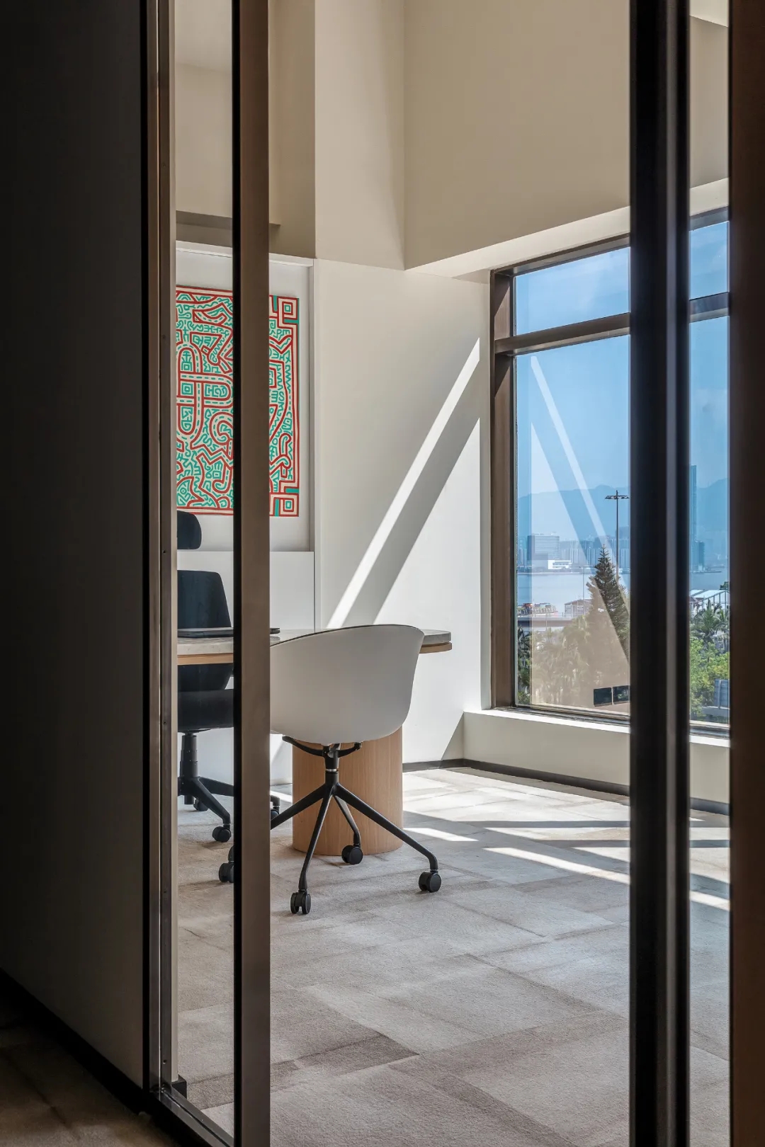
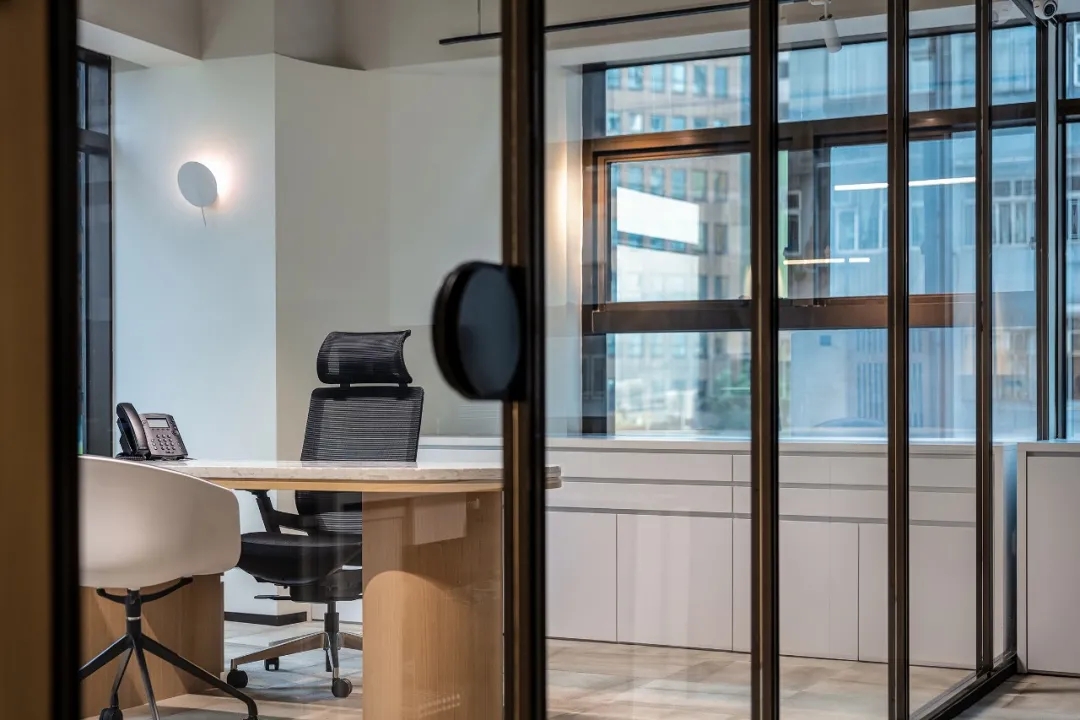
最后,在私密办公区中,设计师用大面积玻璃窗将自然光源引入室内,透明的玻璃门,让整个区域视野更为开阔。
Finally, in the private office area, the designer uses large glass windows to bring natural light into the room, and transparent glass doors to make the whole area more open.
此外,墙上还挂着1980年代美国街头绘画艺术家和社会运动者凯斯·哈林(Keith Haring)的涂鸦作品,浓厚波普艺术风格为办公室带来更具活力的视觉元素。
In addition, graffiti by 1980s American street artist and social activist, Keith Haring, hangs on the wall,bringing a more dynamic visual element to the office with its strong pop art style.
一个积极、有温度、开放包容的办公环境会能让员工在此产生价值和归属感,设计师在满足功能的同时,还应该有意识地为使用者创造情绪价值。
在这个办公室中,设计师在有限空间里,通过模块之间的重组、串联,放大四大功能区价值,消除办公的边界,最终实现1+1=第三自定义空间的未来办公新形态,不仅让使用者心理更加稳定,也为品牌的长足发展起到至关重要的作用!
A positive, warm, open and inclusive office environment will enable employees to create value and a sense of belonging here. Designers should consciously create emotional value for users while satisfying functionality.
In this office, in the limited space, through the reorganization of modules, the designer amplifies the value of the four functional areas, eliminates the boundaries of the office, and finally achieves 1 + 1 = the third custom space, creating the future office new form, which not only makes the user more stable psychologically, but also plays a vital role in the long-term development of the brand!
项目名称:ASA Office
项目类别:办公空间
项目业主:亚细亚瓷砖
服务内容:策划/室内设计
设计机构:Oft Interiors
主持设计:邹卓明/张敬贵
设计团队:Yoyo Au
项目地址:香港
项目面积:164㎡
Project Name: ASA Office
Project Category: Office Space
Project Owner: ASA Tile
Services: Planning/Interior Design
Design Agency: Oft Interiors
Lead Designer: CM Jao / Ken Cheung
Design Team:Yoyo Au
Project Address: Hong Kong
Project Area: 164㎡
转载申明:非常设计师网所有设计案例图片、文字版权归项目方案设计者所有,禁止商业转载和应用。
非商业转载请注明来自:非常设计师网。

